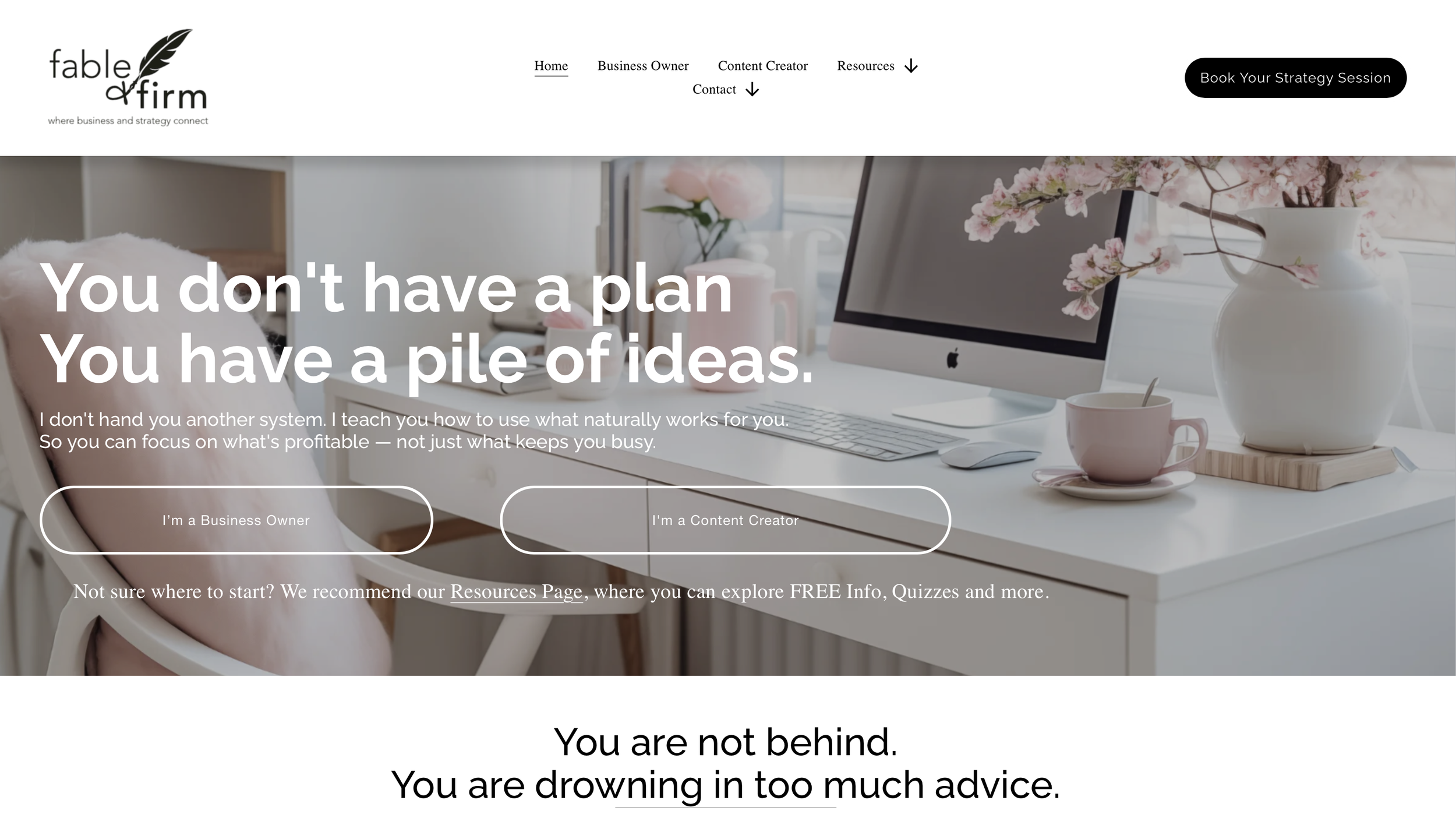
Your Website Is Pretty, But Is It Working?

This may sting a little, but it needs to be said: your website can be absolutely beautiful and still not work.
It can have lovely colors, gorgeous fonts, stunning photos, thoughtful branding, and a layout you spent way too many hours adjusting by half an inch. Yet, when someone lands there, they still might not understand what you actually do, or how they can use it effectively.
That doesn't mean your website is bad. It just means your website messaging isn't clear enough yet.
For small business owners, this is a massive deal. Your website is not just a digital brochure; it is the virtual front door where people decide whether they trust you, understand you, and want to take the next step.
✨ The Golden Rule of Web Copy: Pretty gets their attention. Clear gets them to move.
The 10-Second Website Test
Here is the simplest way to audit your current website messaging. Send a friend (or a total stranger) to your homepage, let them look at it for exactly 10 seconds, and then ask them to answer three questions:
Who do I help?
What do I help them with?
What should they do next?
If they can't answer those three questions instantly, your website is asking your visitors to work too hard.
Most visitors won't do the heavy lifting. They will simply click away—not because they are unkind, but because they are busy, distracted, and trying to quickly figure out if you have the fastest solution to their specific problem. Your website's only job is to make that answer easy to find.
The Biggest Website Messaging Mistake
One of the most common traps small business owners fall into is starting with themselves instead of the visitor.
Your story, values, and personality absolutely matter for building long-term trust. But when a prospect first lands on your site, they aren't looking for your biography yet. They are asking themselves: Am I in the right place? Can this person actually help me? Do they understand my problem?
Your homepage needs to quickly connect with their immediate need before asking them to care about your origin story, your philosophy, or your favorite brand values.
A line like "Welcome to my little corner of the internet" may feel warm, but it doesn't tell someone why they should stay.
A beautiful paragraph about your passion may feel true, but it doesn't explain what you actually offer.
A clever, abstract headline might make you smile, but if people don't understand it, it isn't doing its job.
Clear beats clever every single time.
The Three Questions Your Copy Must Answer
To create a homepage that converts, your messaging must answer three core questions right away:
1. Who is this for?
Be specific enough that the right person instantly feels seen. Instead of vague phrasing like "for everyone who wants support," use language that names the actual person:
Overwhelmed small business owners.
Creative entrepreneurs with too many ideas.
Service providers who need clearer offers.
2. What problem do you solve?
This should sound like a pain point your ideal client actually feels and talks about. Avoid high-level fluff like "I help you unlock your potential." Instead, speak to the real-world friction: Are they struggling to clarify their offers? Do they need to build simple systems? Are they spinning in decision fatigue? Make the struggle plain.
3. What should they do next?
This is where many websites quietly lose hot leads. The visitor is interested, but the next step is buried. Should they book a call? Take a quiz? Read the services page? Buy now?
A clear call to action (CTA) isn't pushy; it's helpful. People should never have to hunt for the door.
Signs Your Website Messaging Is Unclear
You may need to clean up your copy if you notice any of these red flags:
People still ask what you do after visiting your site.
You consistently get inquiries from people who are not a good fit.
Your homepage says a lot of words, but none of them are specific.
You have multiple offers, but no clear, logical path between them.
Your primary call to action changes from section to section.
You keep redesigning your pages because "something feels off."
That last one is incredibly important. We often assume the design is the problem because layout is easy to see. But more often than not, the layout is perfectly fine—the words are just unclear.
Offer Clarity Makes Your Website Stronger
Your website cannot clearly explain offers that you haven't fully defined yourself. If you have too many services, overlapping packages, vague package names, or undefined outcomes, your website will naturally struggle to organize them.
This isn't a copywriting failure; it’s an offer clarity issue. Before you rewrite a single line of copy, ask yourself:
What do I actually want people to buy right now?
Which offer is the absolute best starting point for a new client?
What specific problem does each offer solve?
Are my offers competing with each other?
The clearer your offers are, the easier your website becomes to write. Your services page gets simpler, your homepage gets stronger, and your content suddenly has a clear place to point.
Your Website Should Guide, Not Just Impress
A strong small business website doesn't need to overwhelm people with every single thing you know, offer, and have ever accomplished. It simply needs to guide them like a calm, helpful path:
[Homepage] "You are in the right place."
   └── [Services Page] "Here is exactly how I can help."
        └── [About Page] "Here is why you can trust me."
             └── [Booking Page] "Here is your next right step."
5 Quick Fixes to Try Before a Total Redesign
Before you hire a designer or tear apart your entire site, try making these five high-impact updates first:
Sharpen your homepage headline so it states exactly what you do in plain English.
Ensure the very first section (above the fold) explains who you help and how.
Add one clear, primary call-to-action button near the top right of your header.
Simplify your service descriptions by focusing on the outcome, not just the process.
Make the contact or booking page incredibly easy to find in your main navigation.
Website Messaging is Business Strategy
This is why website copy is never "just writing." It is strategy. Your website is a direct reflection of your offers, your positioning, your client journey, and your business goals. When those foundational pieces are fuzzy, your website will feel fuzzy too.
At Fable & Firm, we help small business owners look at the entire picture before they start rearranging buttons and rewriting paragraphs for the seventh time. Sometimes your website doesn't need more words—it just needs better direction.
Ready to Get Your Website Working?
If your website looks great but the inquiries aren't coming in, let’s go back to the foundations.
[Book a Strategy Session or Website Review with Fable & Firm] and let's turn your website into a clear, purposeful path that helps your ideal clients understand, trust, and take action. Your website deserves to do a lot more than just sit there looking cute.